A handsfree delightful experience.
X-Music
Problem Define
Many music enthusiasts find it challenging to control their music when their hands are occupied or their phones are out of reach, like while exercising, reading, or cooking.
Final Deliverable
Project Goal
Many music enthusiasts find it challenging to control their music when their hands are occupied or their phones are out of reach, like while exercising, reading, or cooking.
Design Process
Design Process
Research (intentional and unintentional gesture)
The main goal of the survey is to enhance the music listening experience of music lovers through intuitive and more convenient gesture interaction. In order to achieve this goal, I carried out a comprehensive analysis of my own and other users' body movements and users in different environments such as homes and interviews, etc., through video recording, YouTube video observation and real-time recording.
Intentional Gesture
Through intentional gestures, I have observed that most people use excited gestures to enhance communication and capture the audience's attention. At the same time, these gestures complement some non-verbal reminders of the verbal message, such as when the hostess lists the benefits of a product, she will raise her fingers to make a counting motion, and make the message more difficult to forget.
Unintentional Gesture
Through unintentional gesture, I observed that these gestures can also convey our emotions. Most of these cues are common gesture languages. For example, when a male host introduces himself, he will naturally open his hands to the audience to convey a welcoming attitude.
Take away:
Through the observation of intentional and unintentional gestures, I enhanced my understanding of the impact of gestures on effective communication and re-understood the importance of intuitive gesture actions in user operations which can improve gesture interactions in user interfaces to be more natural and provide better
Representing Gesture
In order for the test subjects to understand each gesture more intuitively and easily, I used procreate to convert the gestures into simplified hand drawings. I found more than 5 participants to test the gesture and ensure that each gesture was understandable and realistic.
First test:
Testing result:
User feedback:
During the test, most users were confused about the use of clockwise and counterclockwise, so I narrowed down the use of clockwise and counterclockwise in the subsequent design.
At the same time, they put forward a new inspiration suggestion. Instead of using two hands for interaction, they could use only one hand gesture interaction, which would make the operation more convenient.
Second test:
In order to make the gestures more understandable and professional, I converted the hand drawings in procreate into wireframes on figma.
Testing result:
Task flow #7
User feedback:
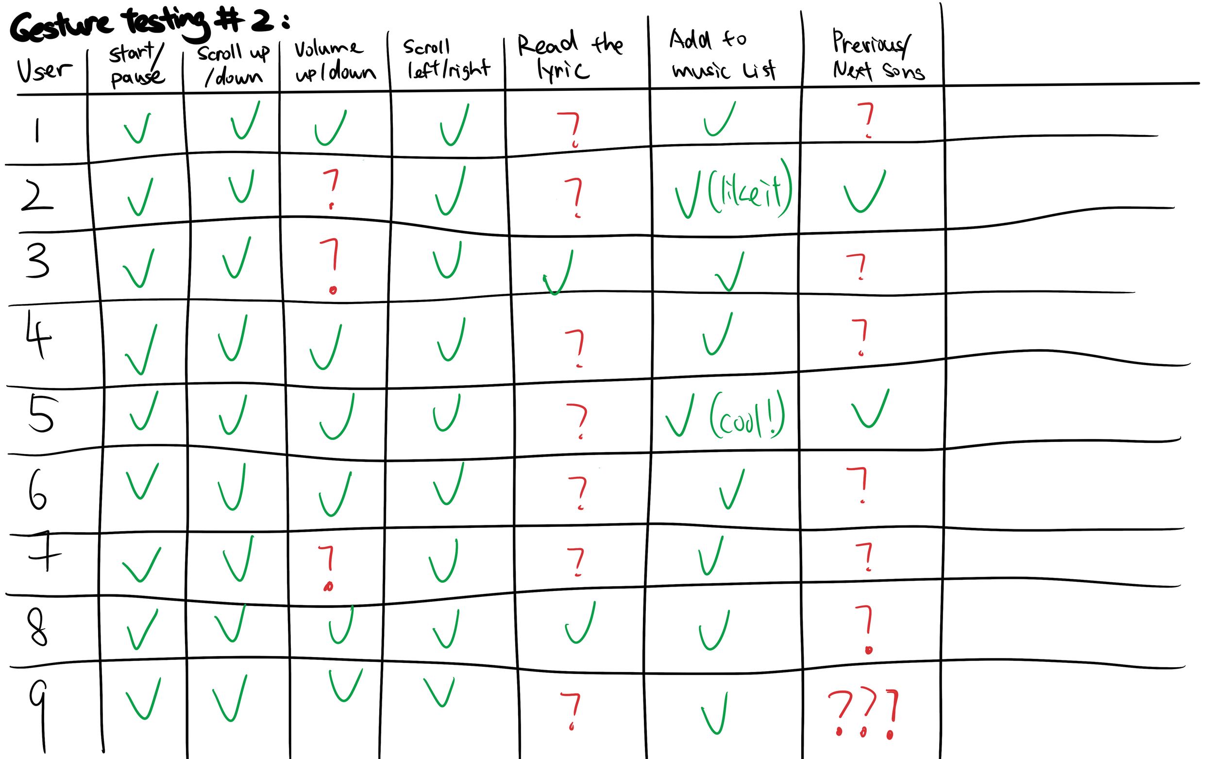
During the second test, I found the two gestures that most clearly confused users, reading lyrics and switching songs.
The gesture of reading lyrics makes it feel more like lifting something up rather than putting lyrics down. The gesture of switching songs often makes users feel that the switching experience is not good and there is no sliding feeling.
At the same time, some users pointed out that although the scroll up/down movements are understandable, they are not comfortable to operate because the limited space for up and down movement results in unnatural interactive movements.
Third test:
In the third round of testing, I changed the color of the gesture to white to make it more consistent with how it would appear in the app.
Testing result:
Echo and Semantic Feedback
It tells users where they are in an operation and tells them whether the system is responsive to their actions. In gesture interaction interfaces, because this is different from fixed physical controls (such as touch clicks or push buttons, etc.), it does not require contact with the screen, so the system needs to provide users with clear and continuous feedback areas to create intuitive user experience.
More example:
Task flow #2
Echo Feedback
In the gesture control interface, when the user makes a specified gesture (such as sliding left and right or up and down, etc.), the echo feedback tracks the movement of the hand and indicates through immediate visual confirmation that the system has successfully or failed to recognized an action.
Semantic Feedback
Semantic feedback provides information about the result of a user action, whether it was a success or a failure. At the same time, it will also provide information about the effects of user operations and help users build confidence in their operations.
User Flow Diagram
I use user flow diagram to shows each step in each task required for the user to complete a specific task and the user choices (potential steps) that may occur until the user reaches the final step. It helps me clarify sequences and think more user-experience-centric to locate points of confusion to ensure a smoother user experience.
Task flow #1
Task flow #3
Task flow #4
Task flow #5
Task flow #6
UI Pattern
Using UI pattern elements usually makes it easier for users to recognize the functionality of the interface and learn how to use it. In the process of looking for inspiration for UI patterns in music app, I narrowed my focus to YouTube Music and Apple Music, which are familiar to most users.
🧐 | During the design process, the biggest problem I encountered was how to seamlessly connect gestures and UI patterns without destroying the original UI pattern. For example, during my experiment, I tried to use a lot of the info layout of Apple music above, but I found that when using the iPhone smart file function to try to detect gestures, this would block the song information in the first column, which is inconsistent with the established Ui layout mode will conflict. In the end, I chose a larger image layout in the first column so it wouldn’t obscure the important song information.
This is my experience process of playing with the ui pattern and the gesture feature for making it become more nature.
Wireframe
Takeaway:
Adjustment that I made:
High fidelity prototype after the user test
I build a wireframe to eliminate final design elements such as color and images during the design process and quickly get into user testing and get feedback.
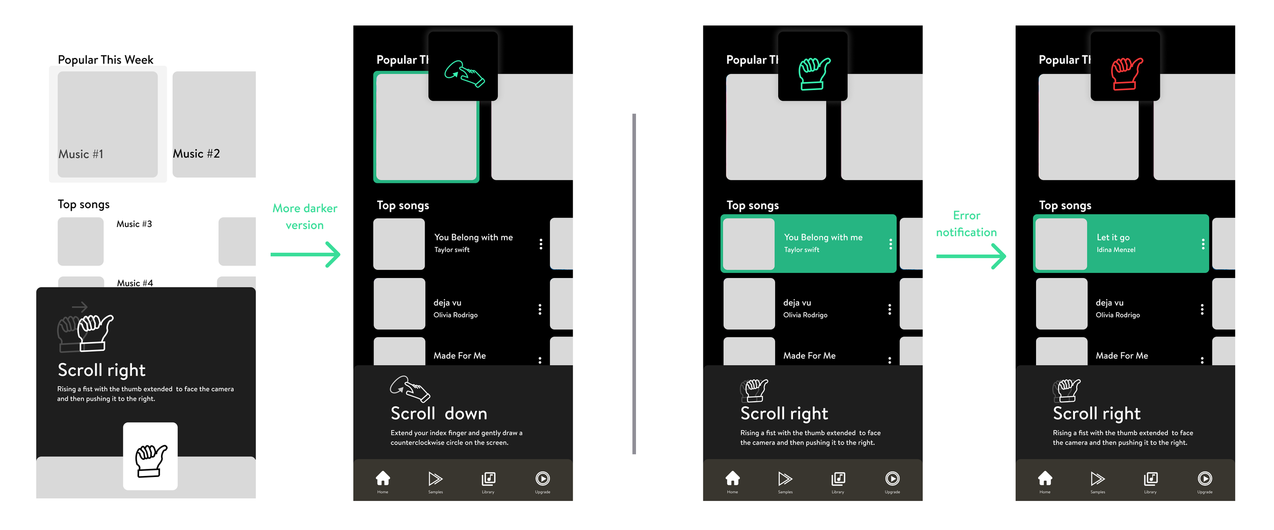
Then, I turn some of the page to more darker version version and decided to add some feature like the error notification to enhance the experience of the gesture tutorial.
Then, while I switch to the darker version, it seems like the gesture been more nature with the interface.
*These steps happened after I am finishing the user testing.
User Testing
I make a user testing script to helped me outline the tasks to be completed, making sure I didn't miss anything that needed to be evaluated and enhancing communication with users.
Feedback from the users:
Add a starting point to tell the user what will happened (like there will be a gesture tutorial starting page)
Rearrange for the onboarding part to move the hand detection to the top part in the interface for better vision.
Make some color changes while the song has been selected instead of darker the original color(activated)
In the teaching part, make the hand moveable(animated it) instead of showing a still image and text
Remain the teaching part in one place to make it consistent
Make some adjustment for the album cover, maybe to a smaller square since it seems like it catch all the attention.
Style Guide
When creating my own guide, I chose to decide on a color palette first. I chose bright green and blue as my theme colors because I felt this would bring a more energetic musical feel to the black background. Then, I chose brandon text as the font of my brand, because I think this font softens the brand color and makes the color not too prominent (aggressive).
Tool and Material
📷 |
Then because I didn’t find a satisfactory background image from the internet for the final video clip, I chose to create a scene that I was satisfied with to complete the interaction between the screen and gestures.
By making the final deliverable, I use green screen video filming technology. When I created my green screen video, I mounted the green screen to the wall of my desk and glued the phone to a light pole to ensure it had a fixed shooting angle.
Afterthought
Challenge:
I think the biggest difficulty in this process is the editing of the video and the shooting of gestures. In the video editing, I spent a lot of time where the hands interacted with the video, and I needed to extend or crop some clips and make each hand angle look like one to continue the integrity of the video.
Takeaways:
First of all, conceptually, this project helped me better understand gesture interaction, or how this technology that breaks "Pictures Under Glass" is more in line with the future vision of user interaction experience and how hands are more important for sensing things and manipulating things possibility. At the same time, this project helped me understand and consider more things that need to be reformed and thought about as a future interaction designer.
Then, technically, I learned AE, a powerful software, which allowed me to see more possibilities for how to promote my own projects in the future instead of just showing single slides. At the same time, not only editing, but also in real life, I learned how to make green screen videos and how to arrange scenes that I am satisfied with to promote my products.
In addition, it help me get deeper understanding of the concept of “Smoke and Mirror” in which help me create an advance prototype and that is important for testing my future concept.
Thought about gesture control:
I strongly agree that gesture interaction is an effective form of interaction, especially when it is inconvenient for users to touch the screen with both hands. Different from the traditional interaction method of touching the screen with both hands, gesture interaction provides users with a more intuitive interaction method, a more natural and convenient interaction, and a more convenient interface for users to access.
Thought about this project:
I'm particularly happy with my final design because I managed to edit the screen exactly how I wanted it to be and create a piece that I think can be included in my portfolio! I think it conveys the concept of gesture control very well and its interface design is clear and easy to understand. However, there may be some interfaces that still need optimization and fine design, such as the music playback interface. I may consider adding more details.
Future Plan:
If there are more opportunities in the future, my next step will be to consider making the gesture teaching interface more detailed and adding more interesting visual feedback. At the same time, I will continue to find old or new users for continuous user testing and make more detailed modifications to ensure that the project keeps pace with the times.


